Welcome, please enter your details below.
12 Feb 2017
Responsive Email design: The top 5 tips to ensure optimal customer engagement
Across all our platforms*, statistically, every single email you send is at least 50% likely to have been viewed on a small screen – such as a mobile or tablet device. Indeed, it is common for emails to be skim read on a mobile device and then later reviewed on a desktop device. It may also be that the email has been forwarded and through this action, there is the risk of introducing a whole lot of (HTML) gobbledygook! This sort of viewing experience simply downgrades you, your brand and dramatically decreases customer engagement. It’s a communication nightmare for all savvy marketers and IT folk!
However, you can avoid – or at least minimize these issues using good email platforms and good content design. So, what do we need to consider for each of the different email sending platforms and user scenarios in order that you can ensure the optimal delivery experience?
Below, I have outlined the common email scenarios and then noted below these are my top 5 ‘tips and tricks’.
First, let’s note the most common email usage environments. These include:
- Campaign email (e.g. EDM bulk email)
- Automated marketing emails (e.g. bulk email – or individual emails sent from a marketing automation function)
- Employee email – everyday employee email from the likes of Outlook, Gmail etc.
- Transactional or system generated email e.g. system ‘auto-responders’
- Statement or transactional email e.g. an invoice with a .pdf attached
For all, there is a simple message: ‘Design for responsive’.
So here are my top five points to consider
- Responsive design and content
Are your emails responsive? (e.g. can the email adapt the shape/content/visuals according to the receiving email client such as Outlook, iOS iPhone) Keep your messaging clear and direct. ‘Less is better’ is a good strategy. - Formatting Visuals and content
Are the images inserted going to work well on all receiving environments? Have you addressed the ‘fingers and thumbs’ issue which means that people can actually click the images/links/icons easily? Tip; clickable links/icons and C2A’s should be at least 48 px square with 28px gaps to make it easy for people to click links on small screens. Keep your content and messaging short and sharp. It invites easier engagement. - Testing
Have you tested the email with end users? Have you tested to see what the email will display like on multiple environments – or indeed what happens when an email is forwarded etc? Tip; the simple check is to test on common devices and email platforms around you. To be sure, you should use your email platforms available testing functionality as a matter of course. If you don’t have one then use a testing software such as Litmus. - Tracking/reporting
Have you looked/reviewed your own sending platforms tracking/reporting function?
Tip; A/B testing is the simplest way to measure for best performance. - Typical user scenarios
Have you considered the impact of changes in user scenarios? For example, mobile devices now offer a low light feature which reduces ‘blue’ light typically used at night time.
Top; consider images that are not to affected by the reduction of /blue light’ spectrum. It will improve the C2A responsiveness.
So – in summary:
- Design for ‘responsive’ first
- Format for thumbs and fingers and user’s environment
- Keep your messaging simple and direct
- Be clear about calls to action
- Be brutal with editing
- Test/track/review reporting
* Cumulo9 has an averaged min 53% mobile opening rate across all our email platforms
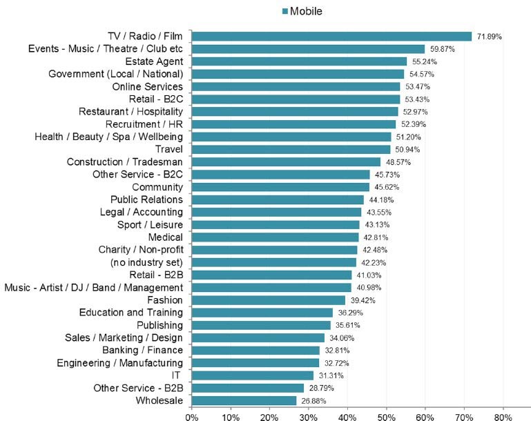
What industry are you in? – the following graph shows the mobile open rates by industry – the IT sector (31.31%), B2B services (28.79%) and Wholesale (26.88%) show the lowest levels of mobile email opens and consumption. (source: Email Marketing Benchmark Report (2016))

Related news
21 Oct 2025


